

Totally unnecessary. And, in the meantime, a necessity.
The devil is in the details. Stonehenge on my Roman battlefields. Windmills on my League of Augsburg table. My 6mm Market Garden Arnhem in the original Dutch late 19th century Renaissance Revival style.
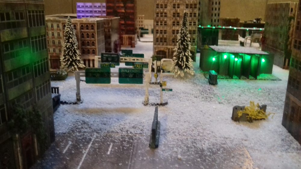
My newest project, SF warfare, must rock, too. I bought LEDs and 10mm street signs to improve the already stylish Dropzone cyberpunk skyscraper city.

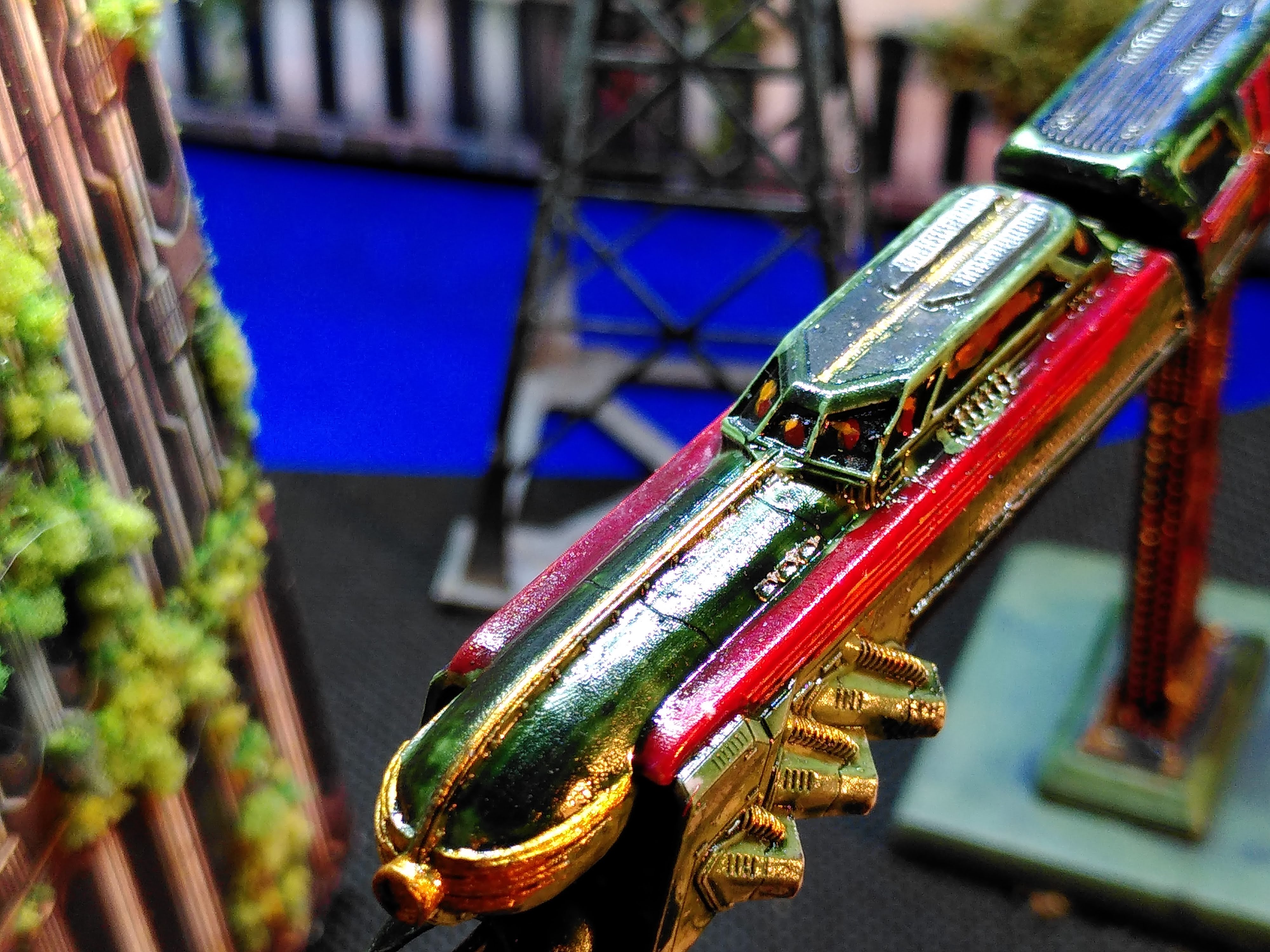
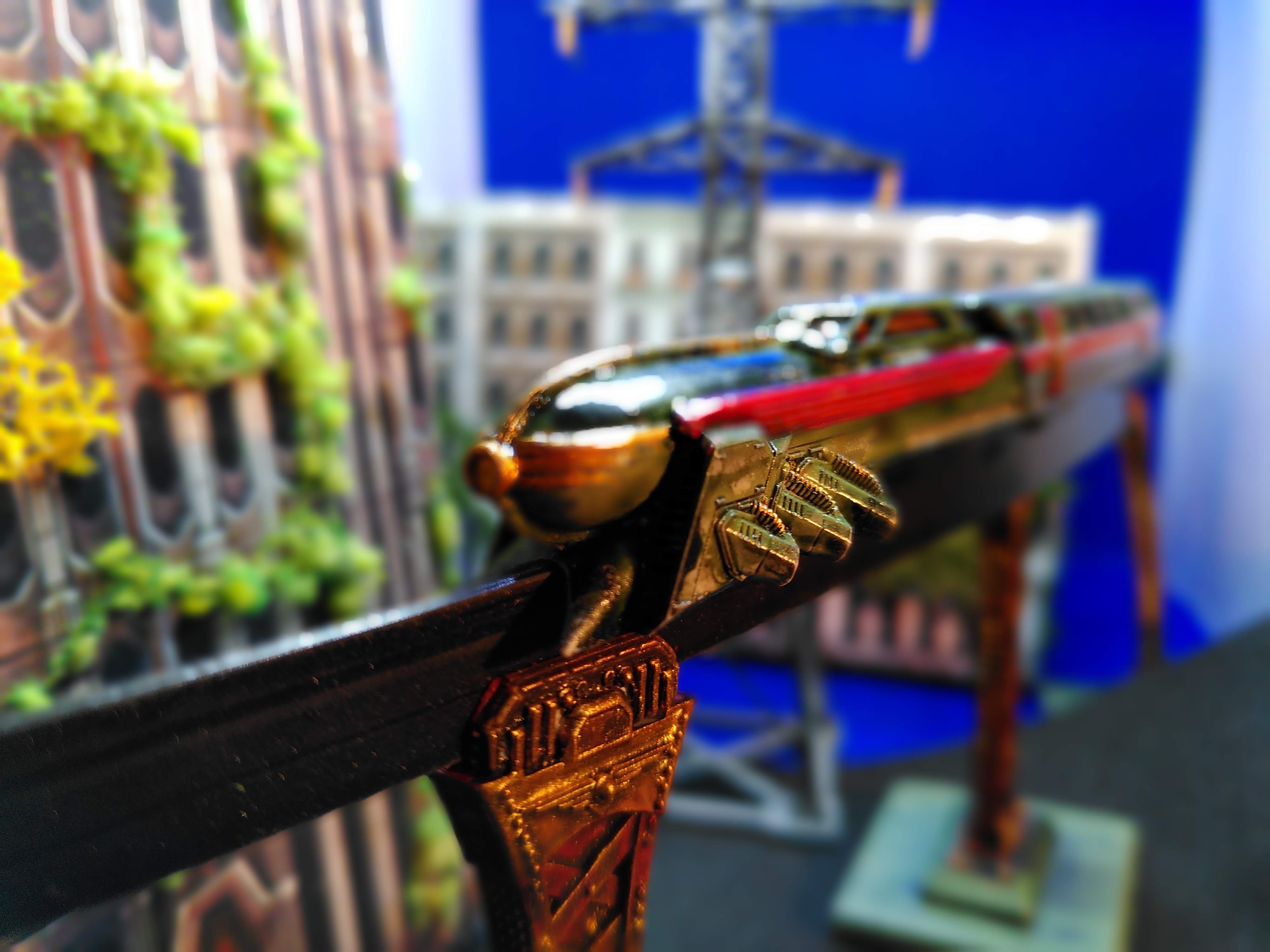
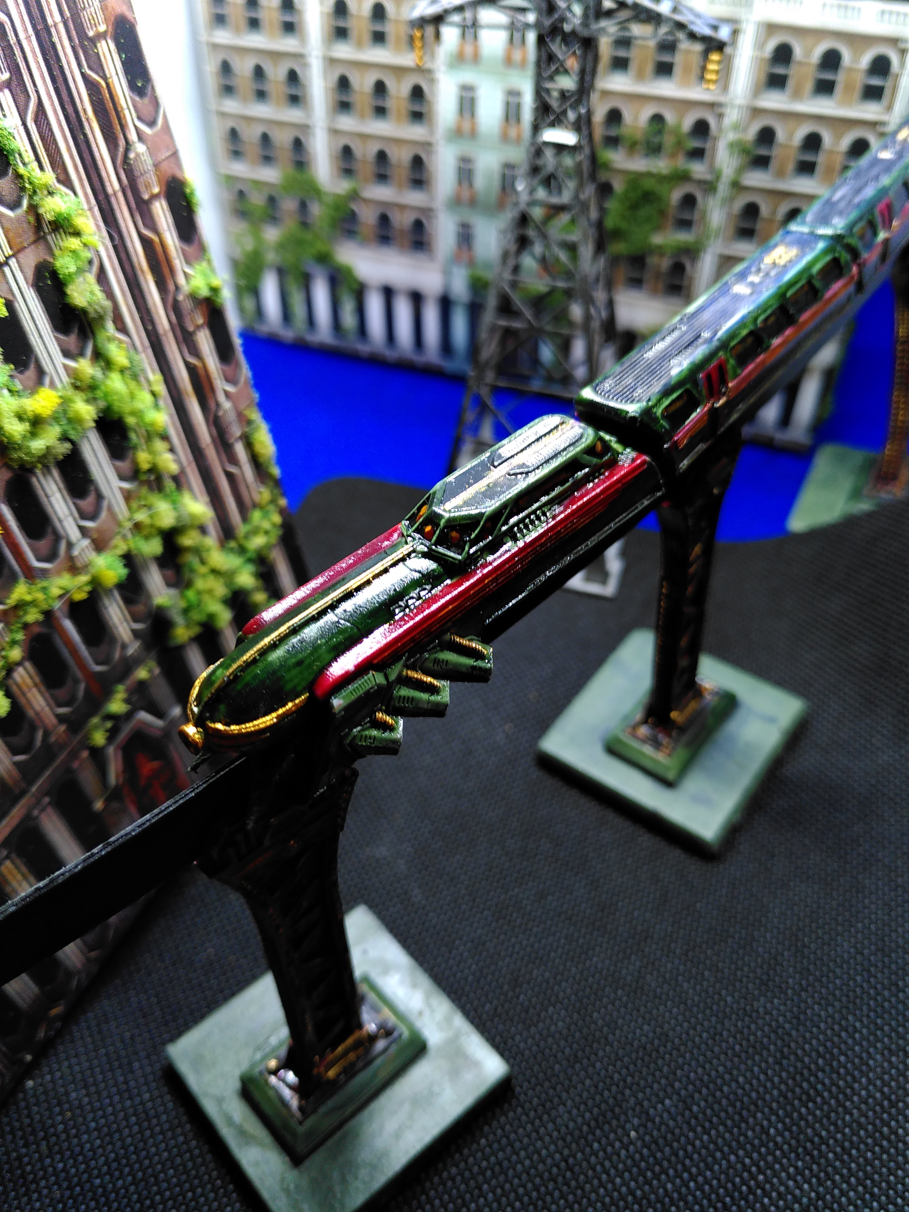
A month ago I finally found the out-of-production Dropzone Monorail via a Facebook trading site.
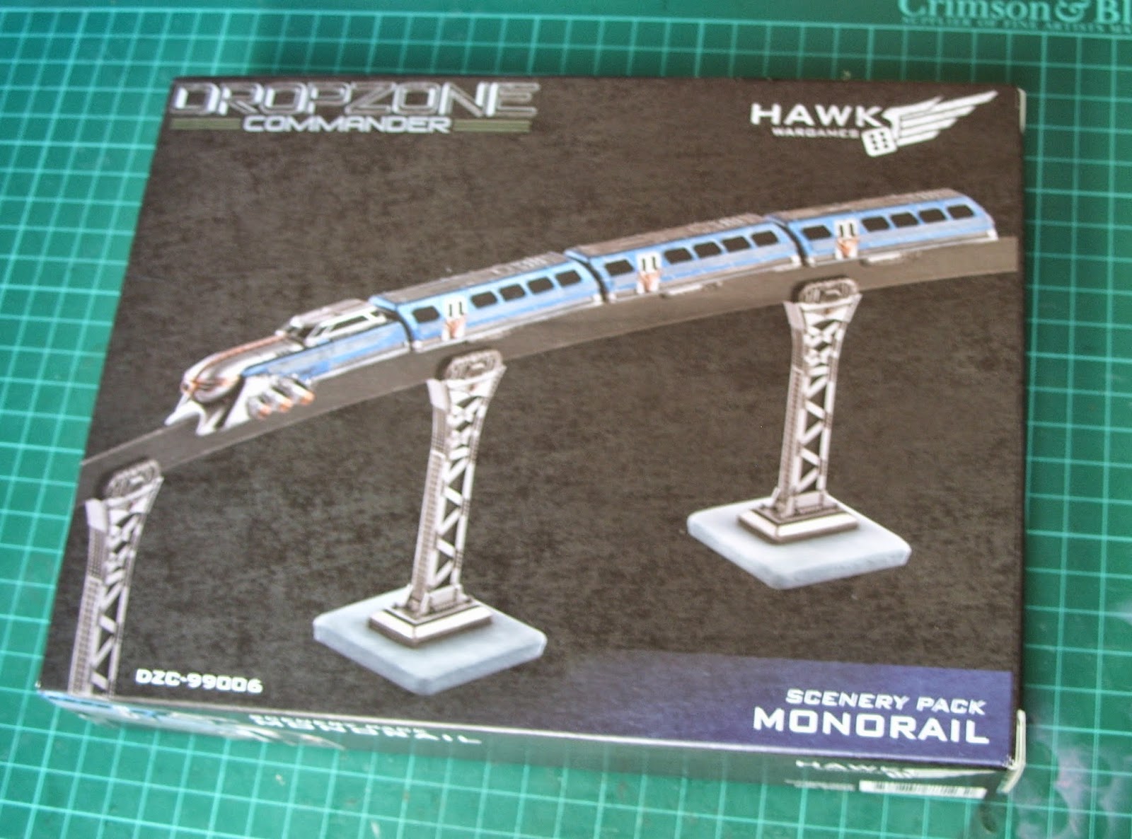
This one. Still boxed. I didn’t think twice and bought it for the original prize, which is 45 pound (aargh!). Same prize as a starter box.!
But a cyberpunk city is not a cyberpunk city without a monorail.
:no_upscale()/cdn.vox-cdn.com/uploads/chorus_asset/file/11689311/batman_begins_movie_screencaps.com_1403.jpg)
:no_upscale()/cdn.vox-cdn.com/uploads/chorus_asset/file/22149843/night_city.png)
So I wanted that monorail. I needed it. Badly.
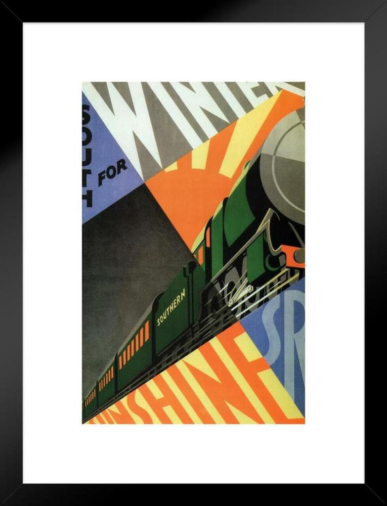
Dropzone is très Art Deco, so I sought inspiration online. I fell in love with green-orange jazz age trains. Cyber Art Deco rocks.

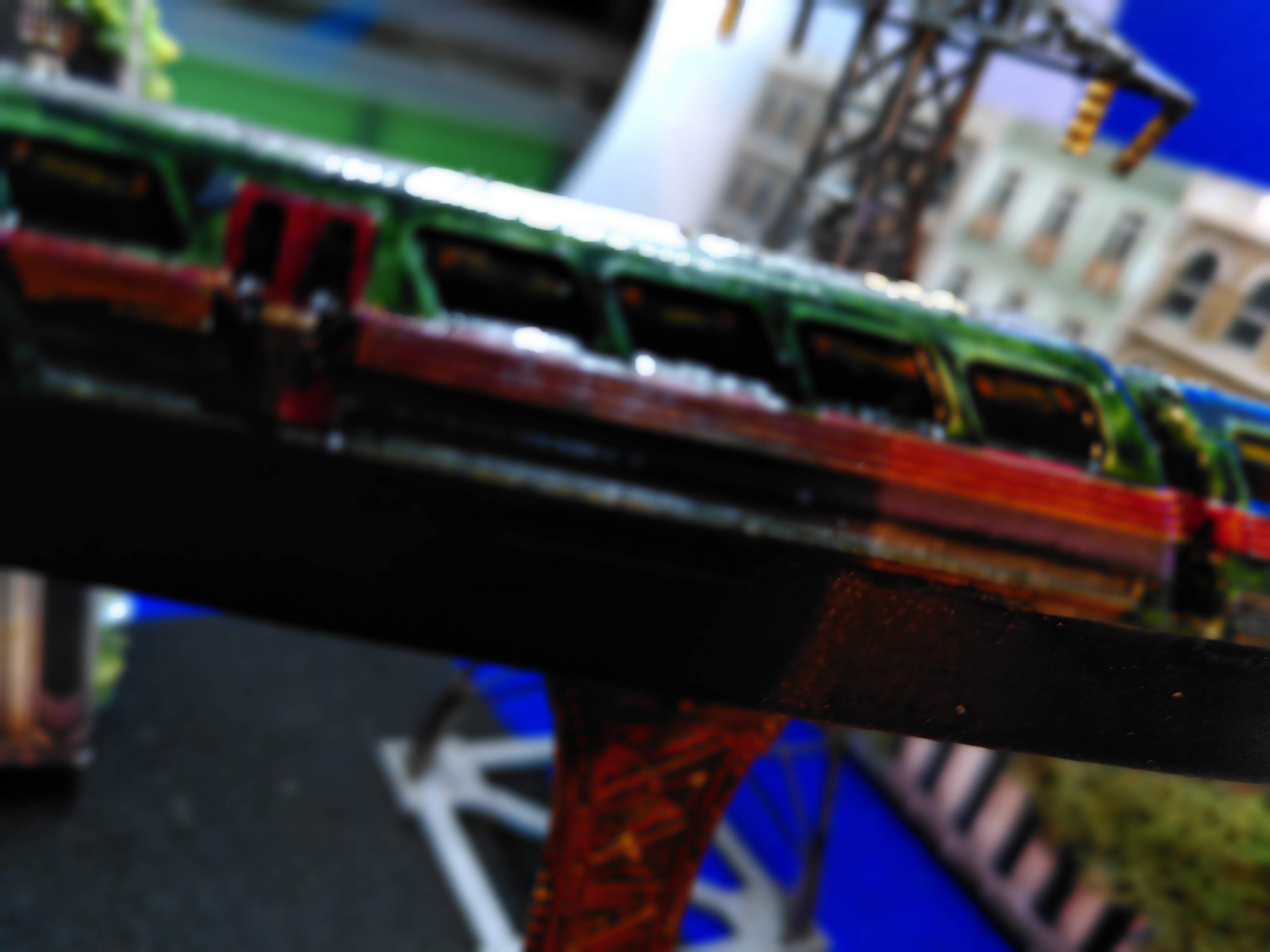
Painting the monorail
Painting was more or less standard: primer, green contrast paint, red ink, gold, green, orange, silver highlights. brown wash on some silver and gold , windows black contrast paint with glossy orange highlights. Gloss varnish. Orange red is complementary to green. On the railcars I added a horizontal purple band under the windows. Purple, orange and green with gold are standard steampunk colour palettes. As I wrote earlier, use a colour wheel to get the best SF and fantasy painting results.
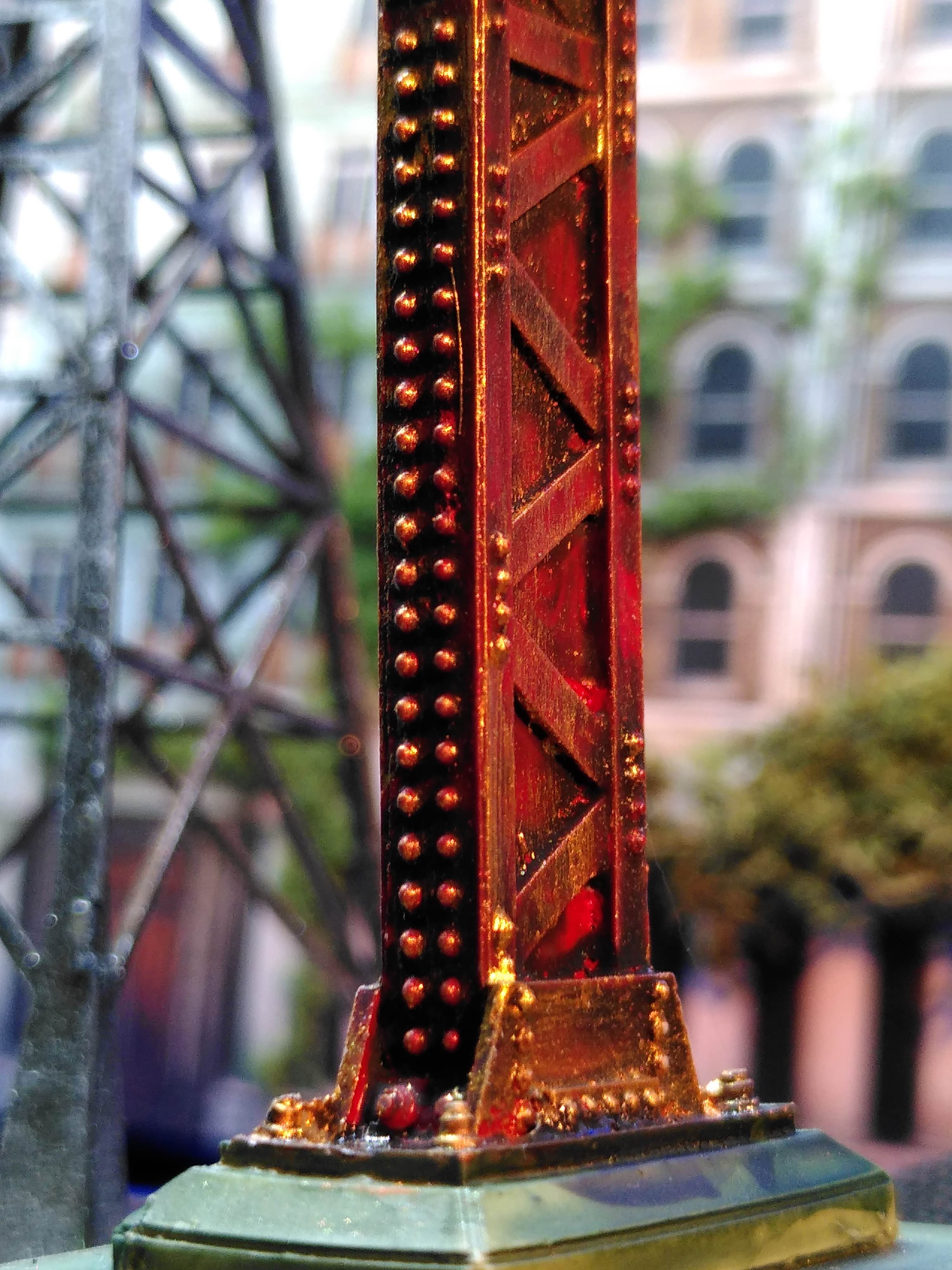
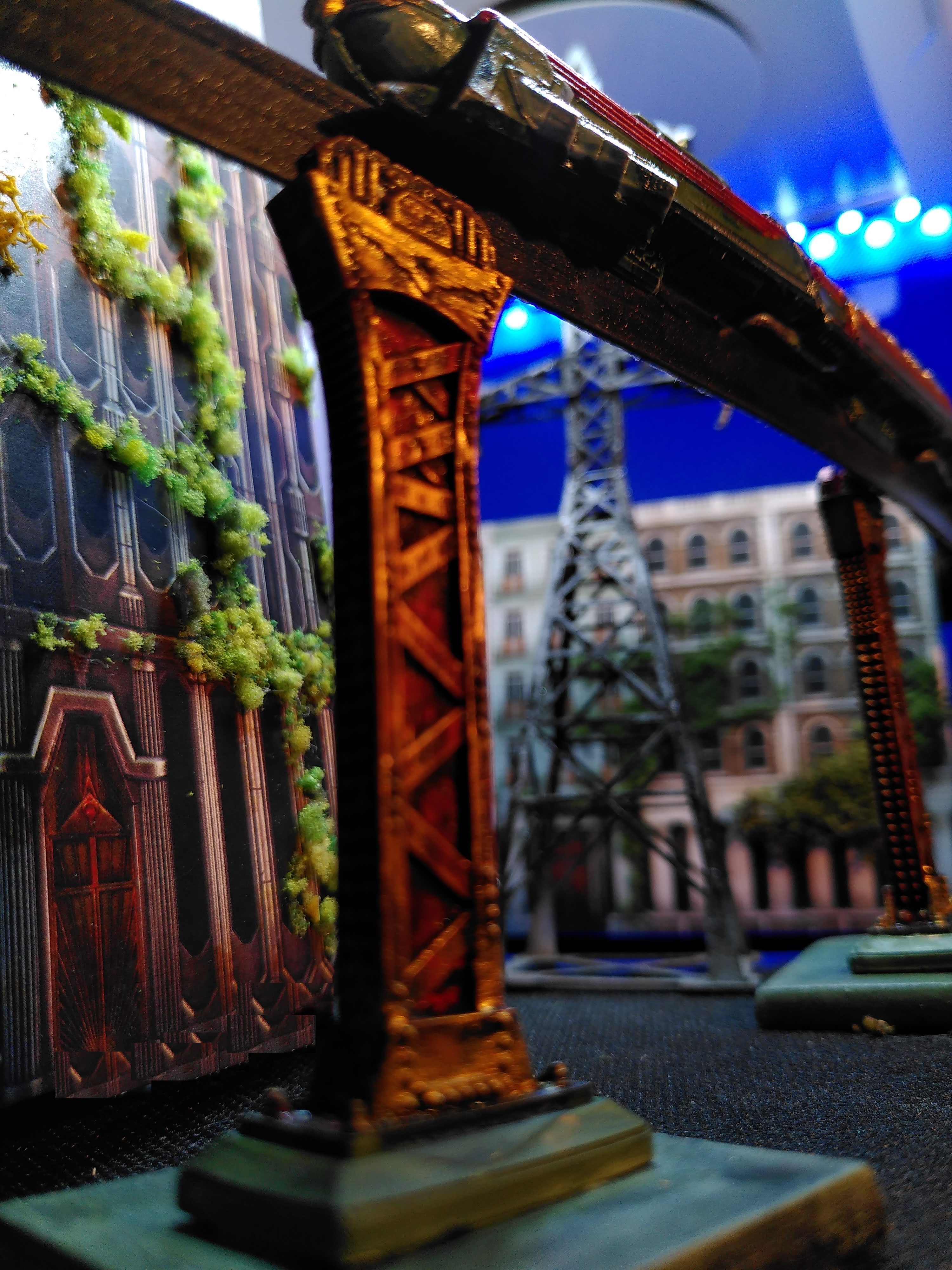
The pylon in the background btw is from 4Ground. Totally unnecessary, but also a necessity…

That looks lovely- I agree with you about cyberpunk cities and monorails.
Cheers,
Pete.
LikeLike