

As follow-up to my generic spaceship & mech painting guide I now publish a small showcase/ painting guide of my four, recently painted, Dropzone Commander armies. With the help of a colour wheel.
I decided to let my painting diverge from the official examples. Nothing wrong with DZCs official colour schemes. But as you know, I was born in the land of Rembrandt, Van Gogh and Mondriaan, and I’m bigger than all three of them together 🙂 I used a colour wheel because I wanted sexy spaceships, not the standard ones. Like Bob Ross I have added a few how-to-comments. I also included (Dropzone) scenery tips.
Basic Painting Technique
Daniel Lewis’ useful official Hawk Wargames instructables on YouTube are gone, but a similar one can be found above. I think this examples show that even newbies can paint a DZC army in a few minutes to a tabletop standard with a single undercoat, a simple wash, a few added details and single highlighting. I was more ambitious and decided to add more contrast and variation.
I mostly used washes, inks or very fluid, thinned paint. I thinned Army Painter (a very pigmented paint) with medium. Thick paints easily destroy the fine DZC details. Paint was thinner than what I use for my 6mm white lead models, my thinned paint resembled a coloured wash. Use GW Contrast Paint if you want a quick fix.
Other basic tips:
- Prime in light colours, not in dark.
- I strongly believe that small scale models look better if you use rich, highly contrasting tones. So I spent a lot of time online looking for colourful, bright schemes. FYI: on pinterest: a collection of Dropzone painting schemes.
- Dropships and vehicles should look metallic, like sports cars.
- I always varnish my miniatures matt. But SF ships/vehicles look better in gloss. Only the UCM, Scourge and Shaltari infantry is matt.
- Make sure your model is dry when varnishing. Wait 24 hrs. After applying decals to my UCM models and a last wash, I was to quick with my varnish. Result: crackling. I had to start all over again :-(,
- When planning colours, use a colour wheel, like, for example, this one. Thus you get harmonious colour combinations. Analogous colours often look fine. Use one complimentary colour to add variation. Colour theory here. As I wrote before, a copied superhero colour scheme often looks good.
- Extremely highlight the infantry. Dropzone’s resin infantry miniatures are relatively flat, quite mediocre sculpts, compared to Baccus, Adler or Pendraken figures. With extreme contrasts they look fine, though.
- Think about the colour of the infantry base. It’s part of the miniature too.
I don’t have an airbrush, I don’t use a magnifier or 000000 Kolinsky brushes. I’m just a mediocre painter with a lead pile in my dim lit man-cave. I liked several painting schemes done by professional painters in the rulebook, who are for sure more skilled than I am.
Painting took a few evenings per army.
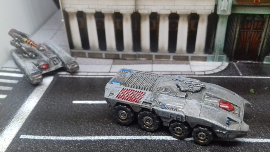
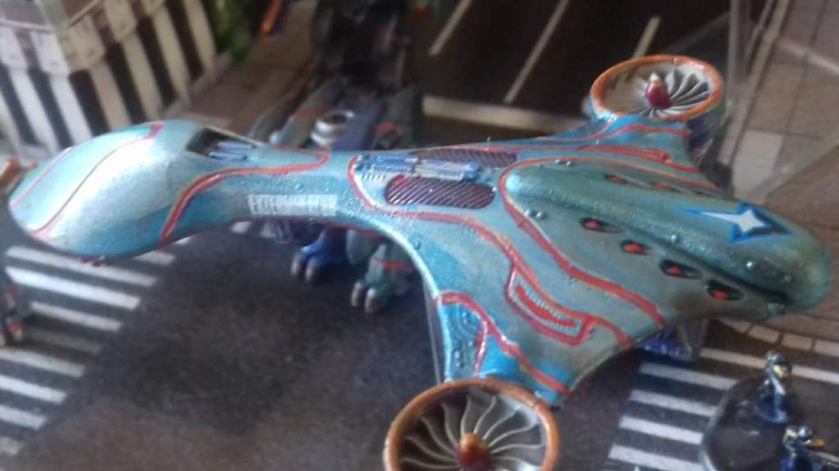
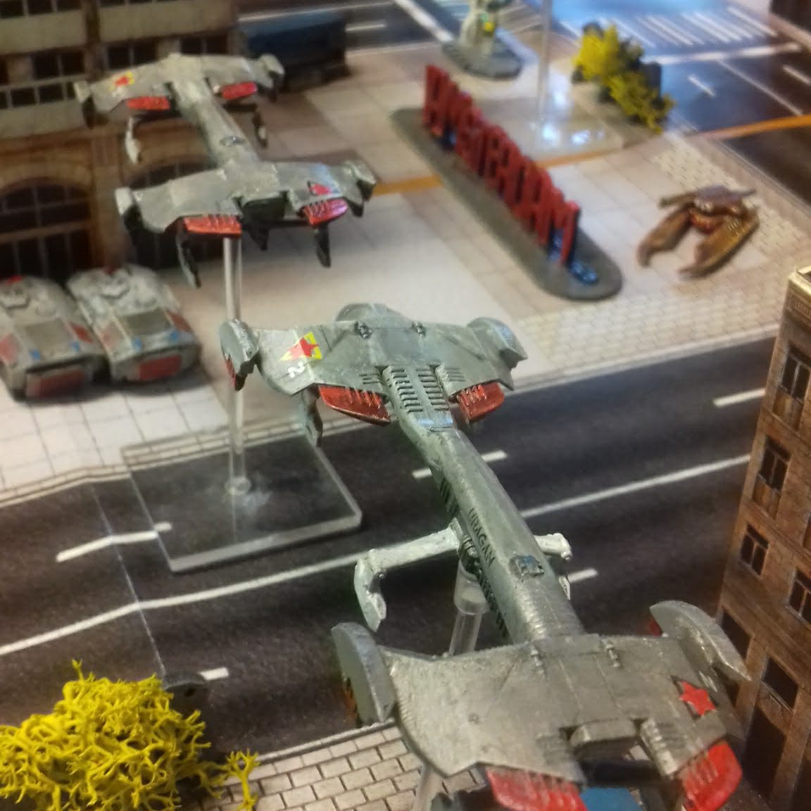
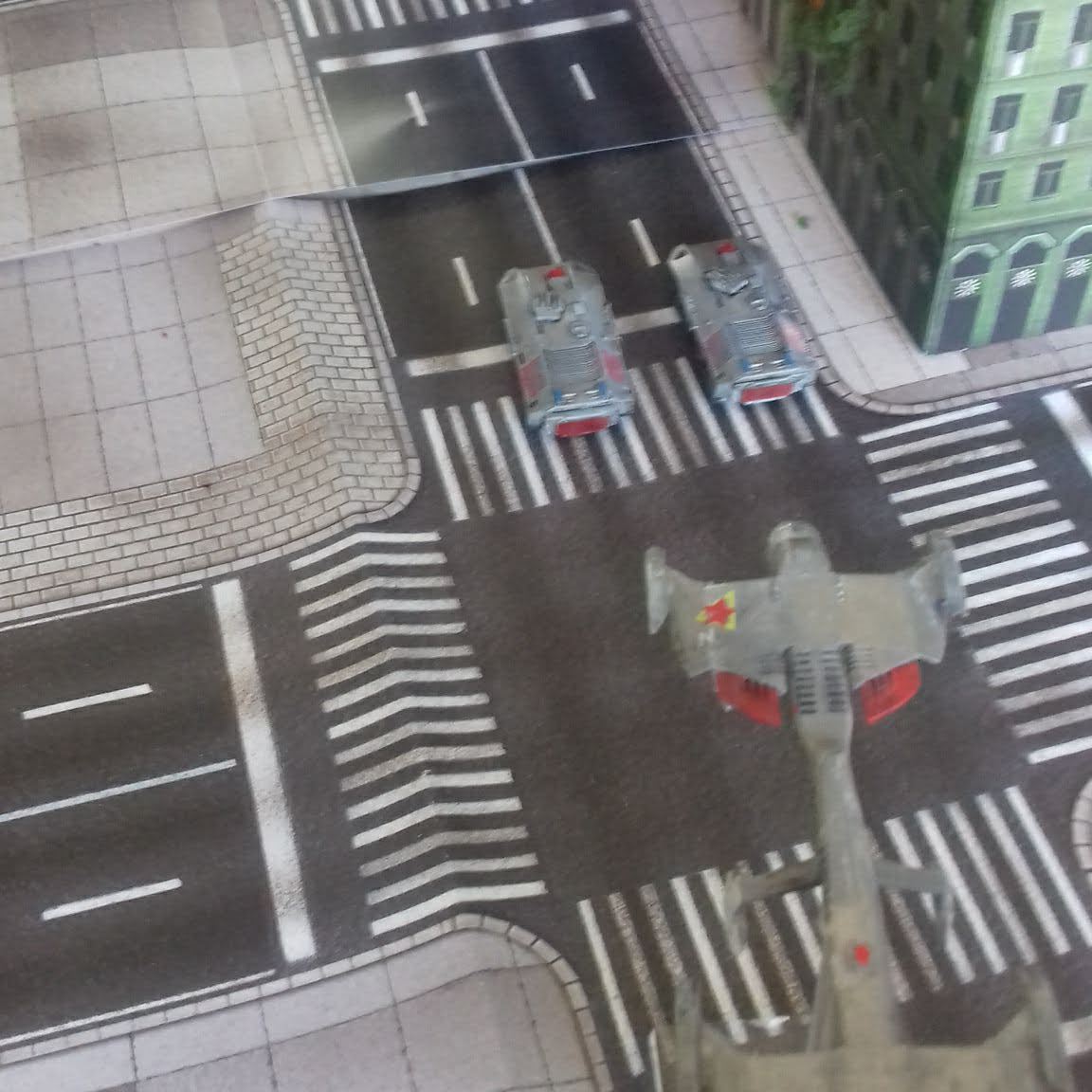
United Colonies of Men
UCM are avengers, the human crusaders against Scourge. Their tanks and dropships look like modern tanks. A standard monotone army green colour scheme is effective because it looks like your familiar national army-next-door. Other recognizable, conservative yet effective choices are desert khaki or a camouflage pattern.
Personally I was more impressed by this futuristic blue/red camouflage colour scheme:
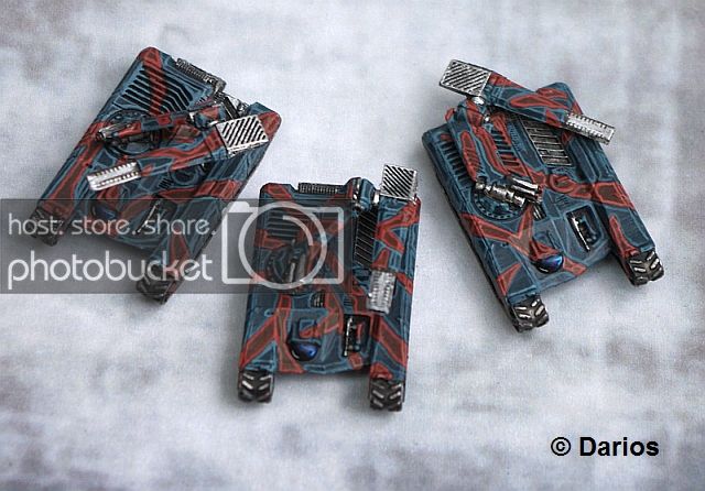
In the end I used the classic SF light grey-with-red as basic pattern.

My UCM Gallery

Painting comments
- Primer hobbystore light grey with a dark wash. I tried dark grey first, but in the end highlighted it to a very light tone. All panels and lines disappear in too somber dark grey.
- I highlighted in several layers, adding more white every time. Step-by-step-highlighting can give fantastic results and eerie contrasts, as you can see in this tutorial here. However: if impatient, paint silver, shade with Nuln Oil, carefully wipe off excess wash and highlight with more silver. Result is silver grey.
- A plain grey miniature is flat. So on second thought I added different shades of grey to liven it up. Hull in grey, but guns in dark metallic, or silver.
- Same with simple blood red. Brown, orange and gold add variation
- Very small dots in the complementary colour light blue add contrast. It’s quickly too much, first I almost overdid it. I don’t want a rainbow of colours: grey and red must dominate.
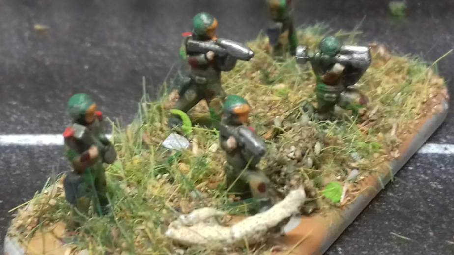
- UCM infantry is sculpted like modern soldiers. So, conforming to these sculpts, I painted them army green with camouflage, with a Sci-Fi orange vizor instead of a flesh face. Painting the shoulderpads in bright red and highlighting the rifles with silver improved the overall look.
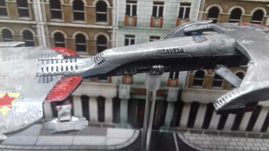
- The neo-Sovjet decals that you see on the dropship can be bought here.
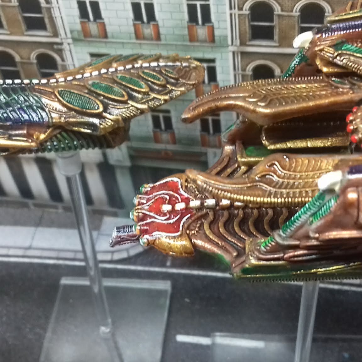
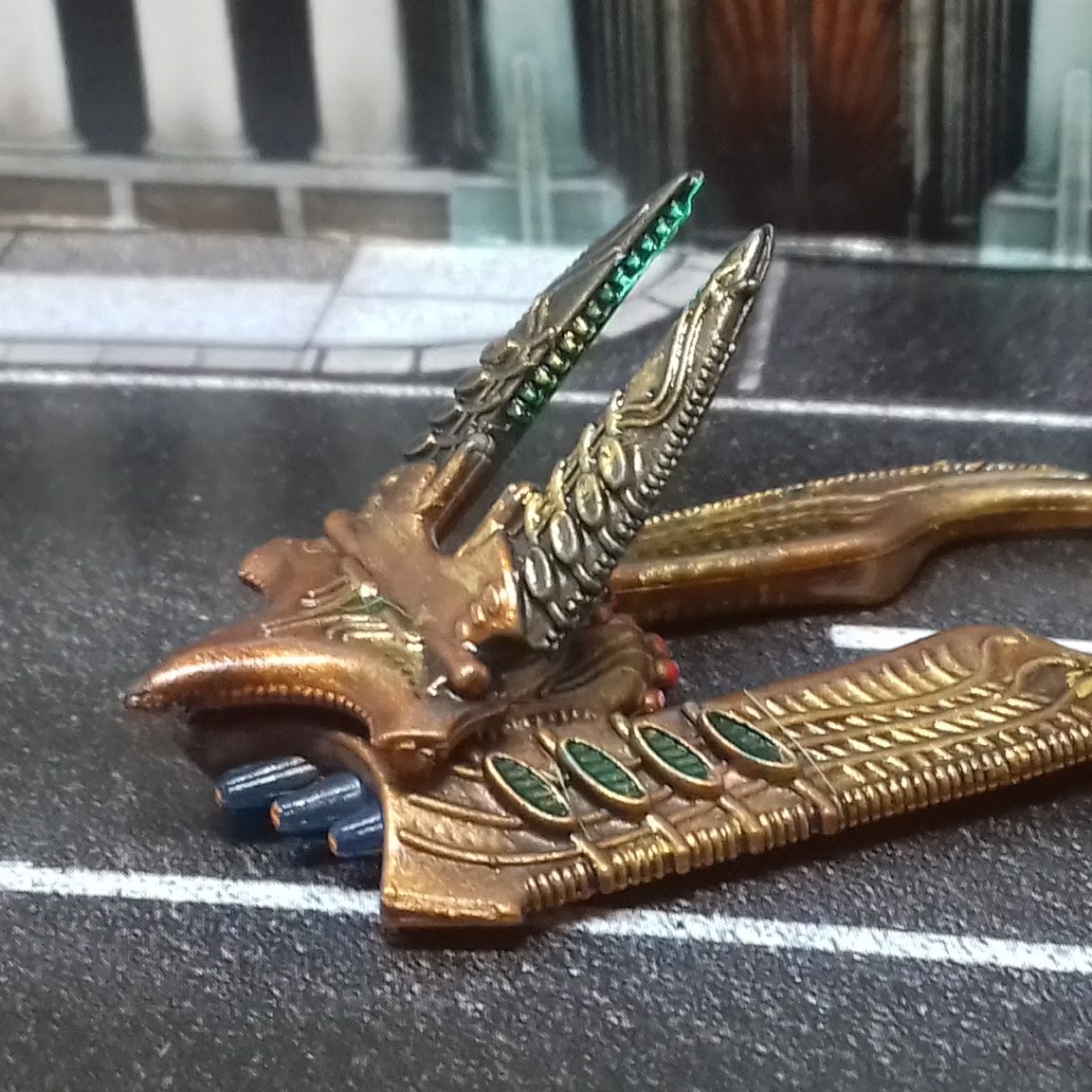
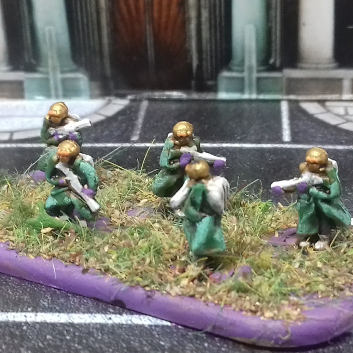
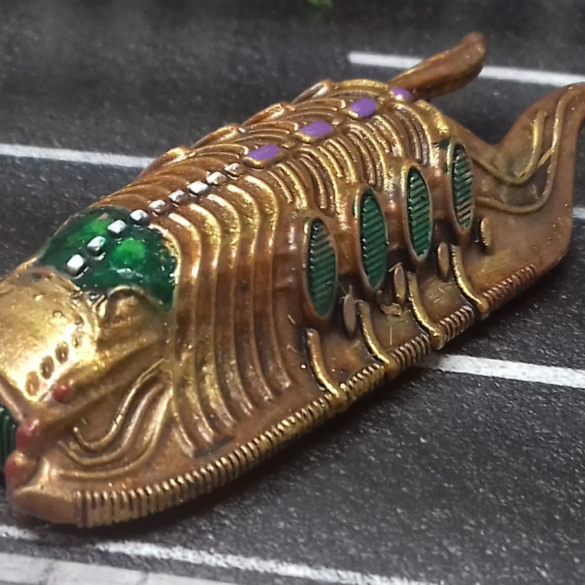
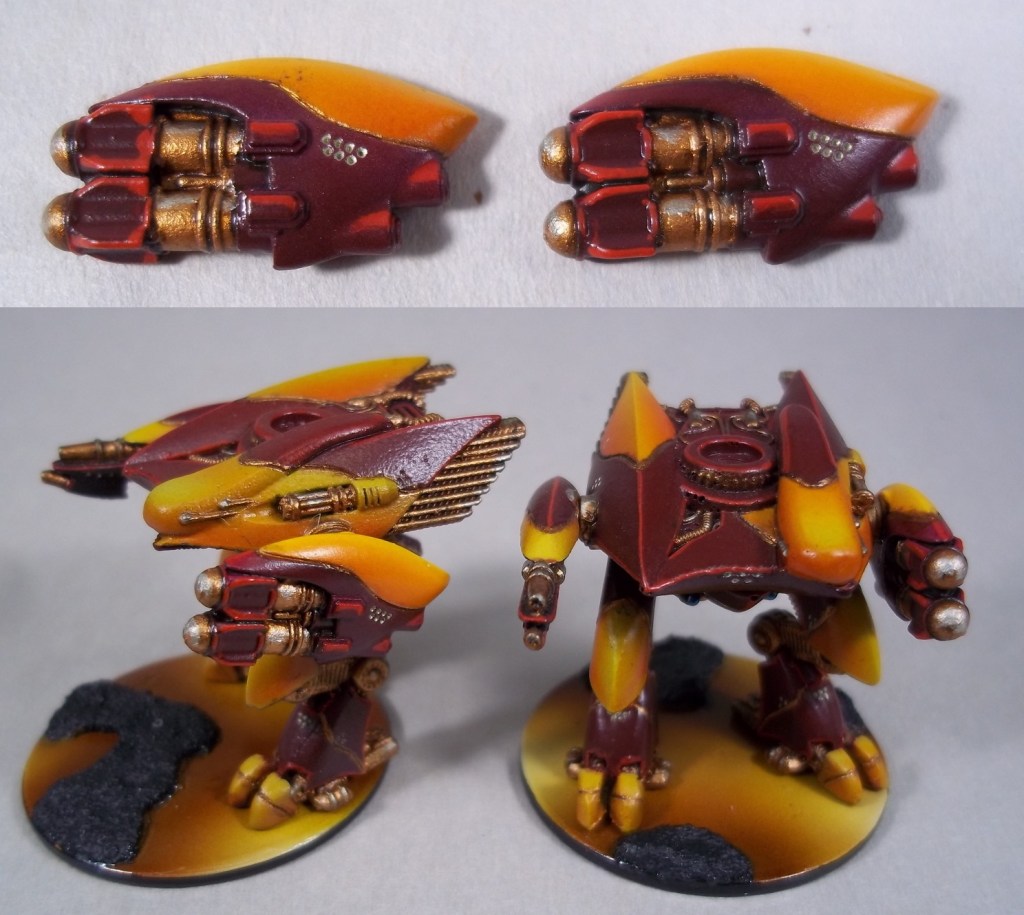
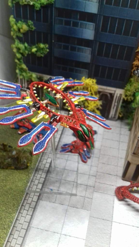
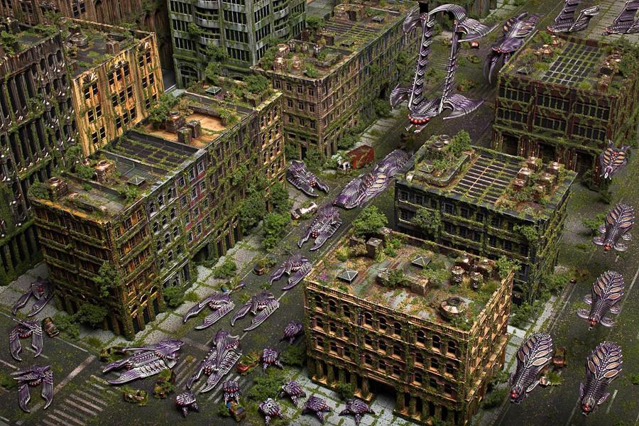
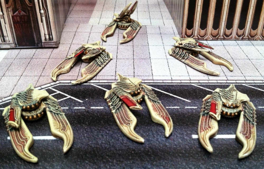
Scourge
Scourge are chaotic evil vampiric/parasitic aliens, according to the background story. Here again, Washington wargamer Leadership11 made a nice speedpainting video with black as base colour and a simple purple wash, that underlines that this race is evil. Nothing wrong with this colour palette.
I wanted more colours, and prefer orange-green-purple mainly because these are the cartoon supervillain colours. See my earlier Scourge work-in-progress blog. Below a nice example of orange/greenish blue.

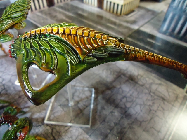
Besides, it’s a nice bright contrast. I decided to steampunk the green/orange colour palette above because steampunk copper is the metal version of orange.
My Scourge Gallery
Painting comments
- Primer hobbystore light grey, then brown gold, then a flesh or brown wash and then a bright gold highlight.
- Orange and green are a brighter combination than orange and purple, so that became my dominant contrast. Red, orange, copper and yellow are analogous colours. Inspired by The Joker and Kingpin I added purple and cold white. The models immediately looked more evil.
- I added purple sparingly, a bit too much is quickly a lot too much.
- These miniatures have a spine. White seemed a logical accent there.
- I painted the infantry in a similar white/purple/green palette as the dropships.
- I primed the infantry bases in contrasting purple before flocking.
- Scourge models are versatile. I’ve also seen beautiful red/black metallic and bone white/red colour palettes on the web. But that’s less supervillain.
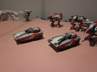
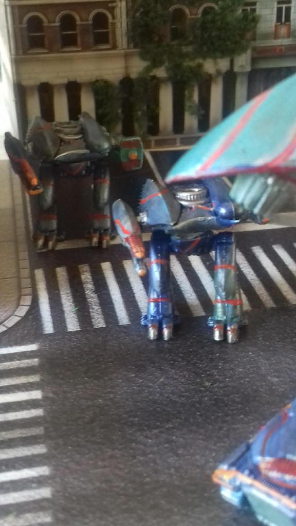
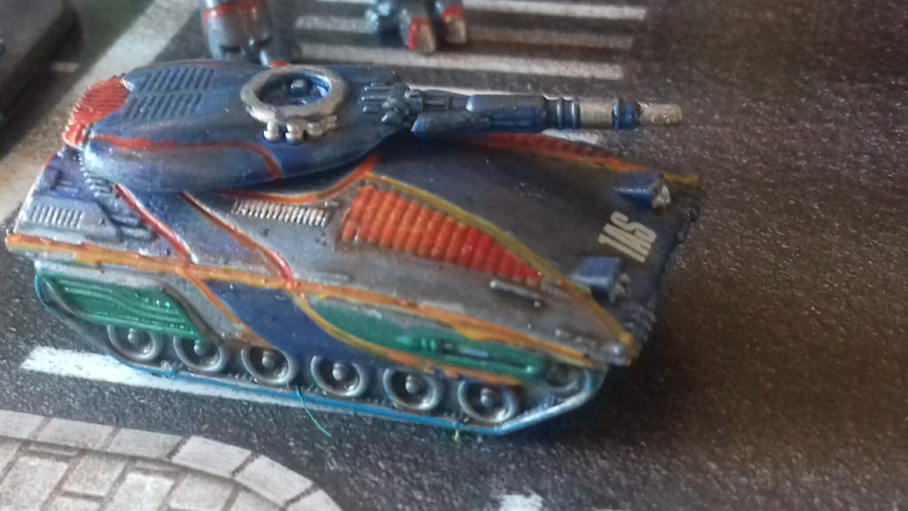
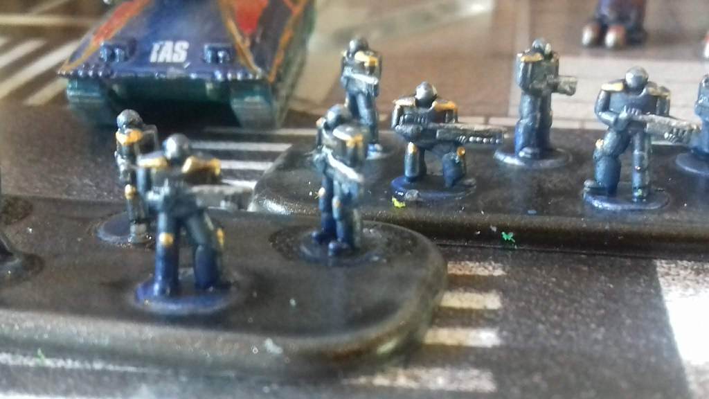
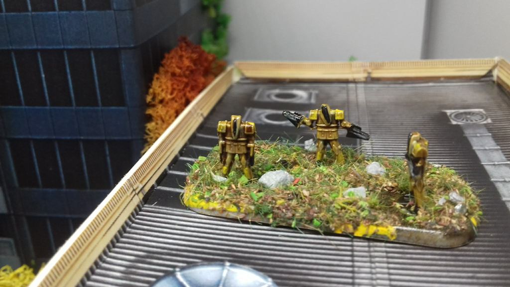
Post Human Republic
PHR are cyborgs. ‘Official’ Hawk Wargames colours are NASA black and white. Looking for more ambitious colour schemes, I found pictures of streamlined futuristic sports cars. Metallic seemed logical. Cyborgs in movies are always metallic.
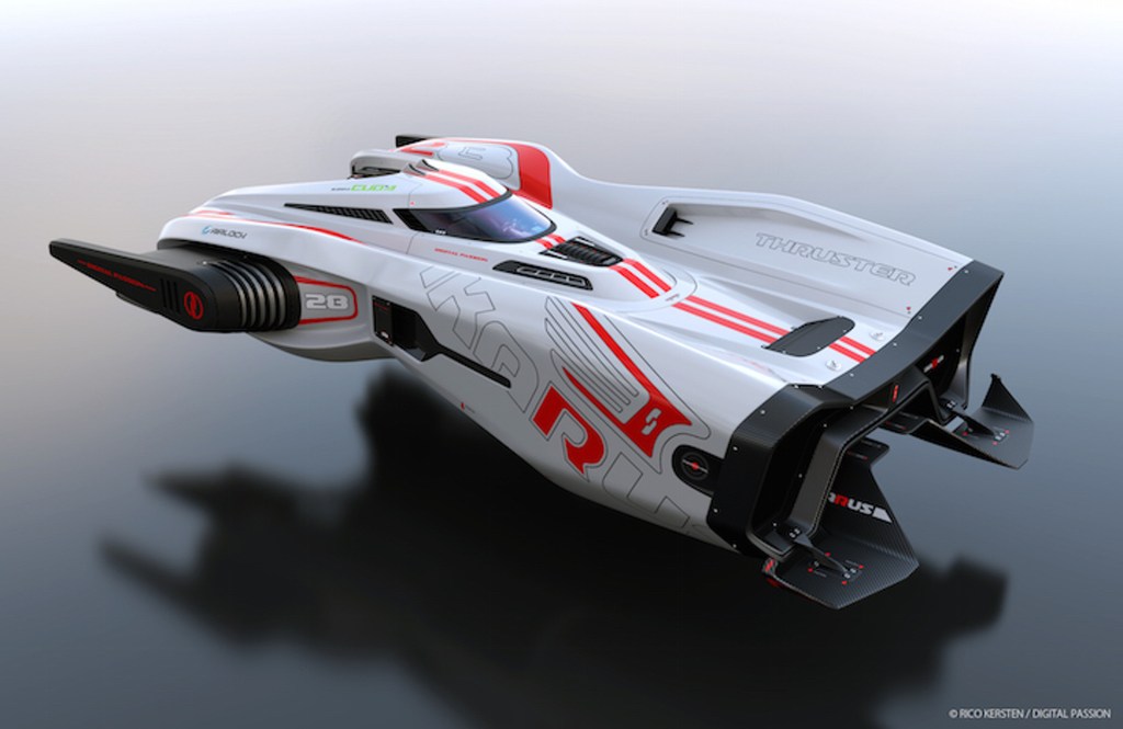
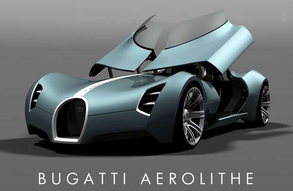
Sharp bright contrasts can help to accentuate the curves of the models, see below.
I experimented with colourful palettes. Often it resulted in a clown or parrot effect. So, my advice, paint PHR with caution. Stick to a small palette. Personally I found TRON more inspiring.
And I’m not the first one, check here. and here.
Black (metallic) is a difficult colour to paint and erases all details, so instead I switched to metallic light blue/ultramarine/cyan.
My PHR Gallery

Painting comments
- I primed with GW Corax White, followed by a metal wash. Priming with metal might be just as good, I think btw, and saves time.
- Instead of stark contrasting colours I used analogous colours and some blending to accentuate the streamlined form of the models. Ocean sea colours with complementary contrasting orange lining, as advised by my colour wheel
- The glowing lines are easy. First a smal orange line and then a red ink.
- On close inspection the cyborg infantry looked like 10mm 40K Space Marines. So I didn’t hesitate. I painted their bases metallic black, and unlike UCM/Scourge no flocking, a metal-metal combo that reinforces the power armour/ robocop look. Gloss finish.
- The Hammer Slammer stickers add character.
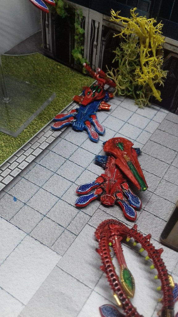
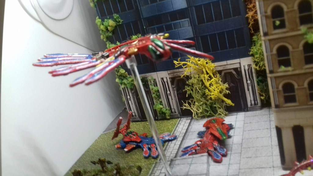
Shaltari: The Disco Faction!
I liked the orange studio colours and the youtube video. Orange is in fact a fantastic colour. Shaltari are insectoid. I googled pictures of colourful insects for inspiration.
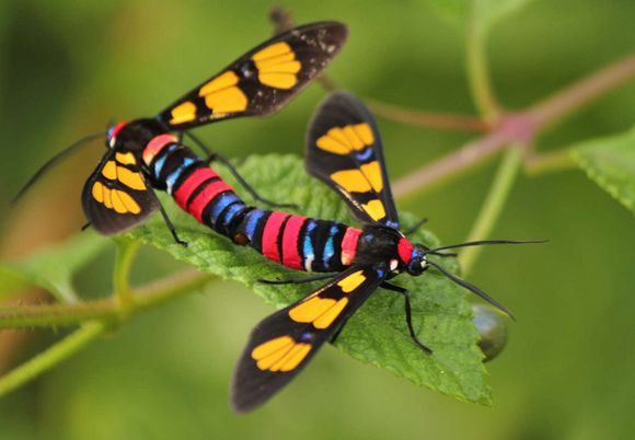
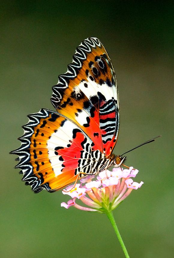
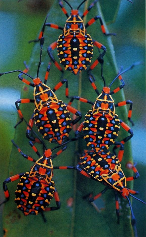
Don’t focus on the insects alone. The colours in the picture are in harmony. Red-blue green (background) are triadic colours. Orange and green (center) are complimentary, and so are red and light blue (right).
So my main colour palette would be red/light blue (the Spiderman-colour scheme) with a touch of green. With added white, yellow and black for dramatic contrast.
- Primer Corax White. Base of GW Contrast Paint Blood Angels Red. I used my older red GW ink first, but that was more pinkish and dried up unevenly, the coffee stain effect. I can attest that Contrast Paint is better than ink.
- My insectoid infantry was inspired by wasps.
- The more colour and fine lines you add, the more elaborate the painting is. I used: red, blue, white, black, yellow, green and a greenish yellow, gold, a brown wash, a black and a blue and a green wash = 12 colours. In retrospect I underestimated how detailed this faction is. So the 12 finely detailed vehicles took an awful lot of time. Next batch will be simpler.
- I added GLITTER! Standard glitter from my little daughter’s hobby crafts box, for christmas cards and other fun. The eyecatching small glitter dots give the eerie alien look that I wanted.
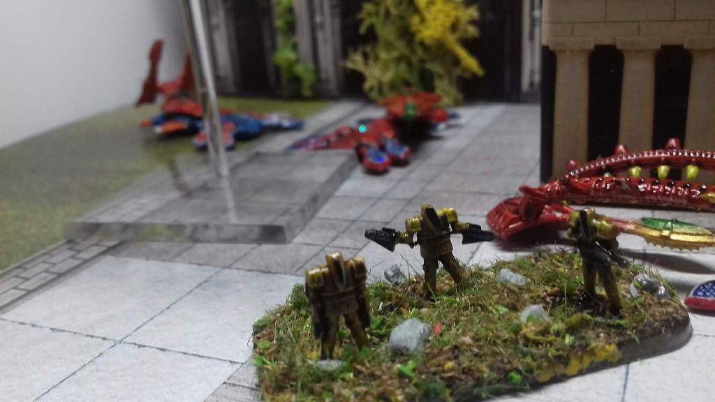
Dropzone Scenery upgrading
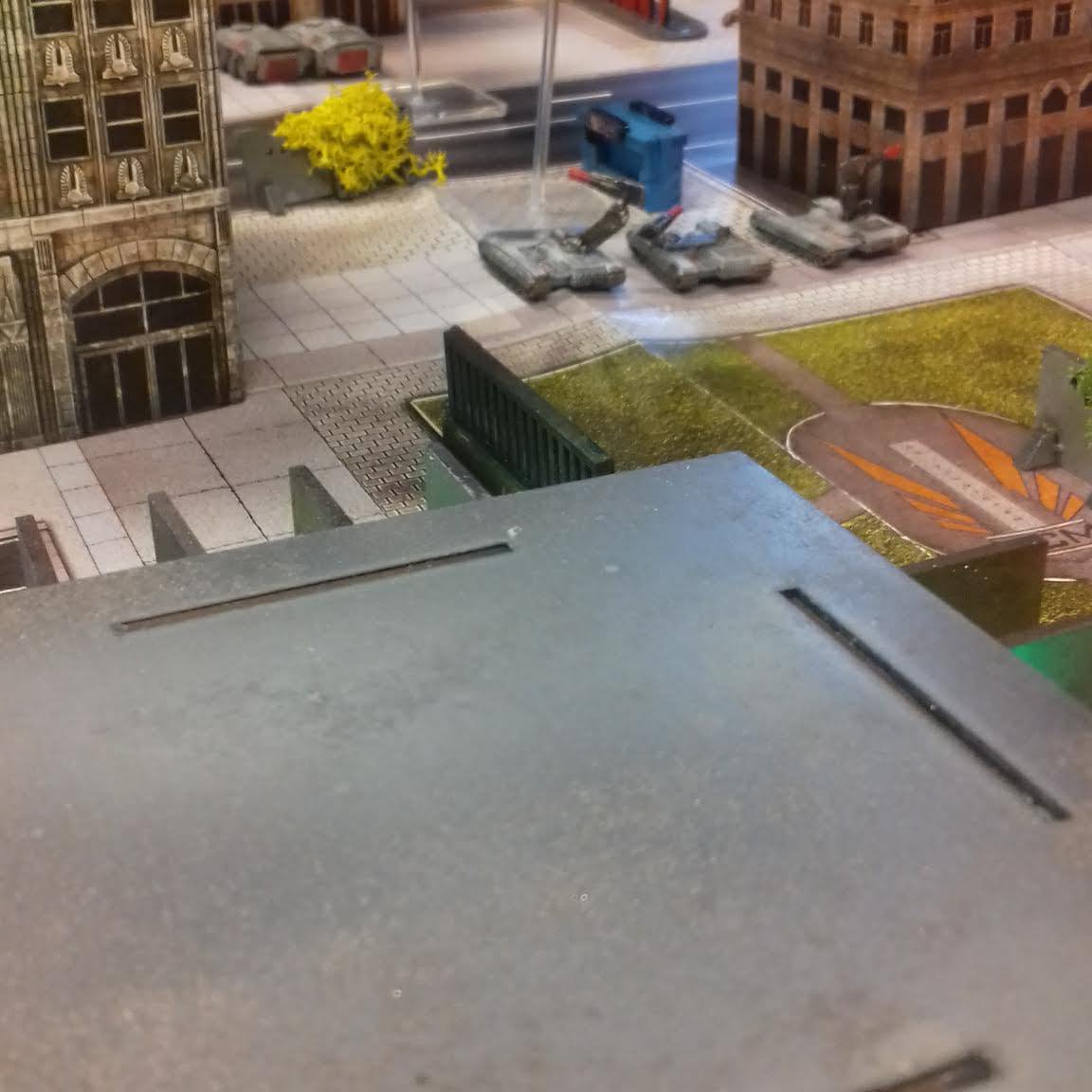
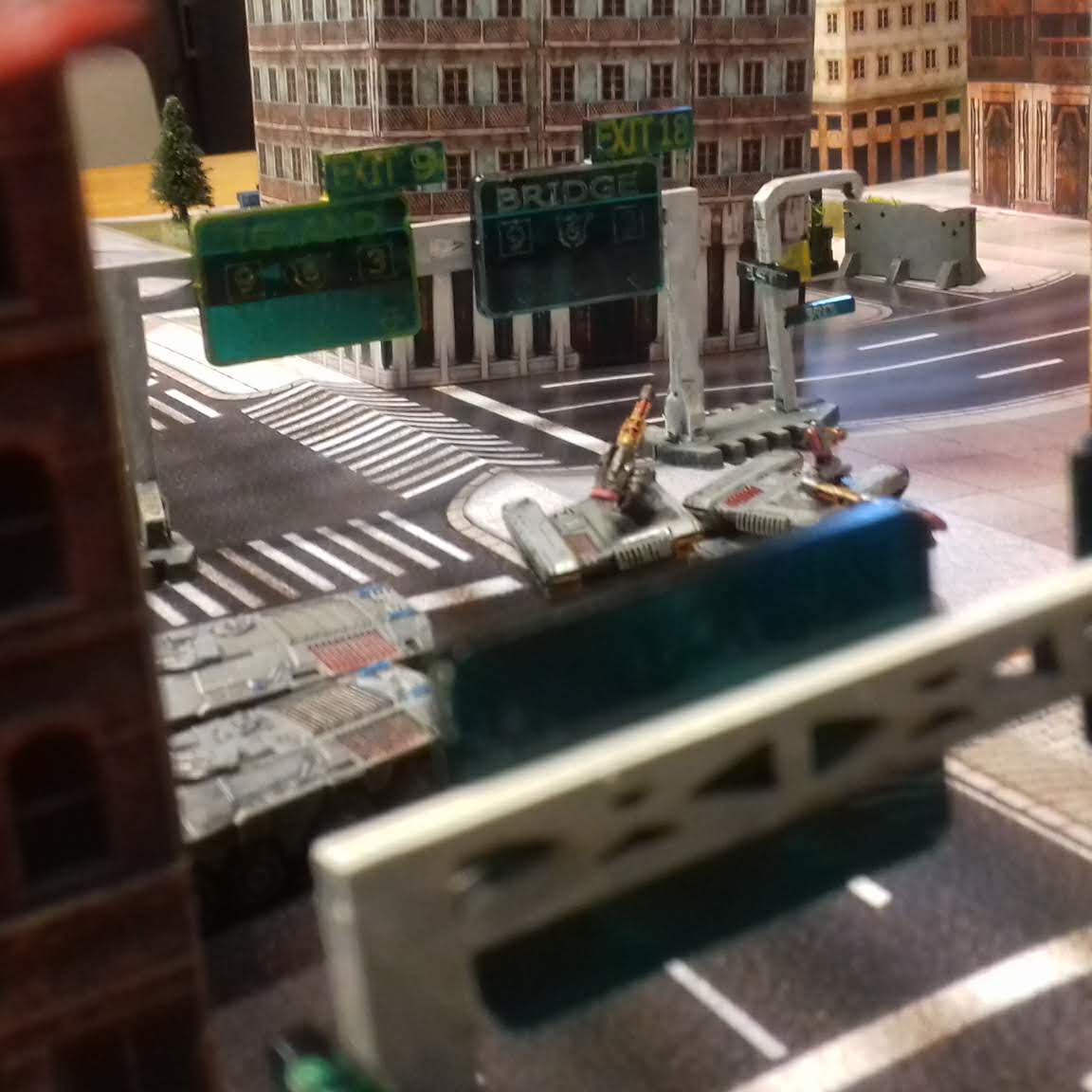
My table. Just as outdoor battlefields need trees and mountains to liven them up, city battlefields need traffic lights, signs, fly-overs and large pylons. Try a model train shop or Iliada Studios paper terrain. I added the TTCombat city scenery and flock. I also added LED-lights.
- Sexy models need a sexy table. Post-Human Gamer published an overview of the DZC scenery options (link). Pictures of tables can be found here.
- CainTiberius invested a lot of time in 3D-ing his Dropzone cardboard. Also, you can download and self-print balconies and aircon-units to glue on the structures.
I like the 3D-ideas, but after experimenting, I don’t see the need. Instead I carefully glued and flocked the cardboard buildings and varnished them ultra matt with Army Painter. The final result is perfect for a standard good-looking hi-res game. Add a 1-2 official MDF and/or resin buildings as centerpieces and the table would be a real spectacle.
- You can make the buildings sturdier with foam. On YouTube a wargamer published a useful how-to-strengthen-cardboard (Infinity) buildings.
- Pezzapoo published instructional videos about his Dropzone modular table.
- Speaking about centerpiece: you can buy N-scale buildings in any railway model shop. Search for Tomix and the Kato brand.
- Other cheap 10mm paper buildings can be found on Wargame Vault.
Downloadable DZC Unit Stat Cards
I found useful unit stat cards on the web, made by Post Human Gamer! Because you never know how long such tools/cards are available, I republish the cards here.

3 thoughts on “Sexy Spaceships: How A Colour Wheel Improves Their Looks!”