


Two years ago – then already long overdue – I blindly bought a discounted Dropzone Commander set. The box gathered dust on my shelves, but finally, more then 4 years after the peak 🙂 it’s party time! In this short blog I share my impressions after unboxing and show you how the effective Cartoon Supervillain-colour scheme can be applied to spacecraft. Any evil alien spacecraft, the palettes are universal.
Unboxing
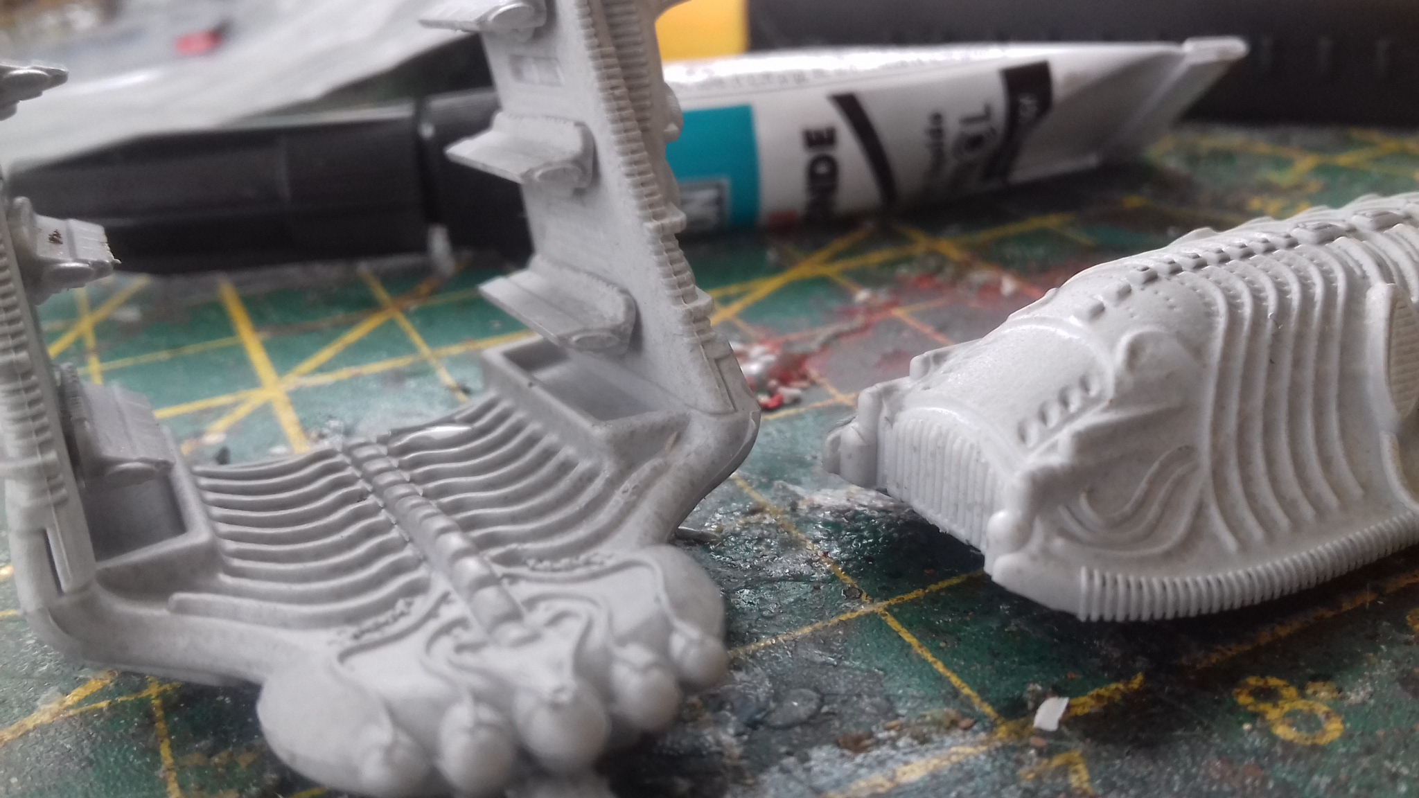
Even post-hype this game is a bargain and still a must have. As you see above, the resin sculpts are beautiful, better than Adeptus Titanicus or 6mm SF, incredibly high standard. No mould lines, and glueing the parts was easy, perfect fit. A 28mm Bolt Action miniature is less detailed and harder to glue than these tiny spaceships, I discovered.

In my original 2-player box (now sold out), sturdy cardboard scenery is included, Buy it asap! The highly useful set, discounted to only 20 pounds) is still available at TTCombat. 20 pre-cut buildings and 24 tiles is a bargain for all 6/10 and 15mm players. You can also download the buildings for free via TTC’s website. It’s useful for all modern and SF games.
The now OOP paperback rulebook is (was) gorgeous. TTCombat sells a new version 2.0. But the previous ruleset 1.1. can be found as PDF and you can still buy the ‘Reconquest’ supplements for a discounted 15 quid as a bundle.
It’s a simple, fastplay, but very cinematic game. DZC 1.1. had positive reviews in the past. Check Shut Up And Sit Down, for example, with tons of pictures. SU&SD wrote:
You will activate a battlegroup, you will use your ruler to move the pieces in it, you will shoot things by rolling some six sided dice to hit and then re-rolling them to damage. There is even a damage chart, although it’s a simple one. In other words, if you’ve ever played a popular wargame I keep having to obliquely reference in these columns, nothing here will surprise you.
(…)
Lots of games have transports, where you put your little things in bigger things to move them across the board. They are usually boring. But DzC makes the daring move of taking these transports as its central conceit. Dropships are absolutely crucial to combat. They are fast, they can pick up and drop off units in the same turn, and they can (usually) fly over intervening terrain.
(…)
I don’t know yet if I will become a regular DZC-player. If the game might disappoint me, I can play Quadrant 13 (an IABSM variant), Future War Commander (a Blitzkrieg Commander variant) or BattleTech with the same set.
Painting aliens as cartoon villains
Colours send coded messages. I experimented earlier with superhero and supervillain colour schemes for Zombicide. Disney and Marvel use the same colour codes: primary colours red-yellow-blue are ‘good’, secondary colours green-purple-orange are evil.

As you see the supervillain palettes give easy combinations that always work fine together for evil types.
Scourge: no monotone
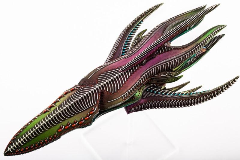
Scourge miniatures are clearly inspired by crabs, scorpions, the octopus and other sea creatures. See below. I tried to find Octopus colour schemes, but they kept changing colours :-).

Simple painting schemes and the official painting guide advise to paint Scourge purple or grey/metal and purple.

Purple is also an ‘evil’ colour. As you see above purple is combined with orange, The simpler painting instruction advises grey metal with purple dots. Although effective, monochrome or grey/purple colour schemes are often quite boring, IMHO.
Purple with green and/or orange?
Evil purple should be combined with evil green and evil orange, to make it arch-evil.

Like below: the painter below combined evil green with bone yellow

I liked that two-tone-yellow/orange-green approach. However the miniatures look reptilian and non-metallic. Orange, in metallic version, is gold or copper. In steampunk pictures it’s often combined with emerald green, the paler, the more evil it is. A few internet pics to give you an idea.
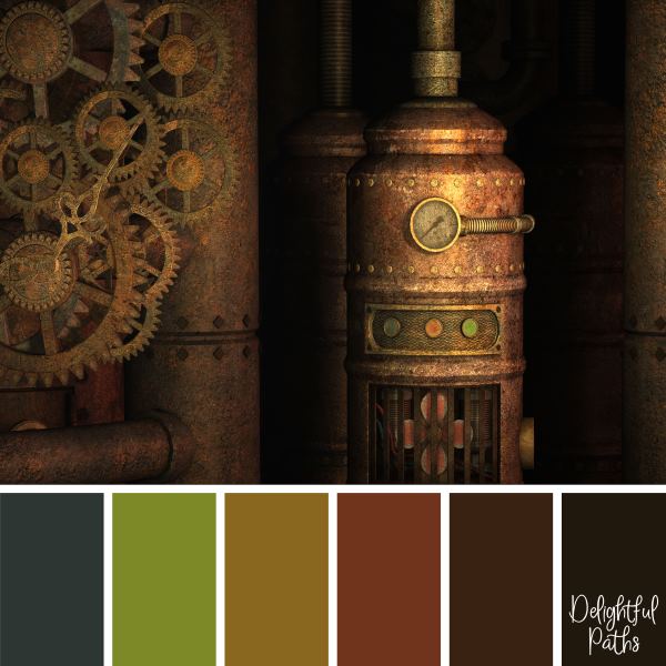

Above a ‘friendly’ steampunk scheme. Evil steampunk is paler, with green fading to white. The octopus is a common steampunk icon. Spaceships images that I liked were very copper with green, pastel blue, and grey.
So the major colour scheme should be copper orange with pale green. I was tempted by the purple/brass scheme below but green/evil gold/evil copper is flashier 🙂


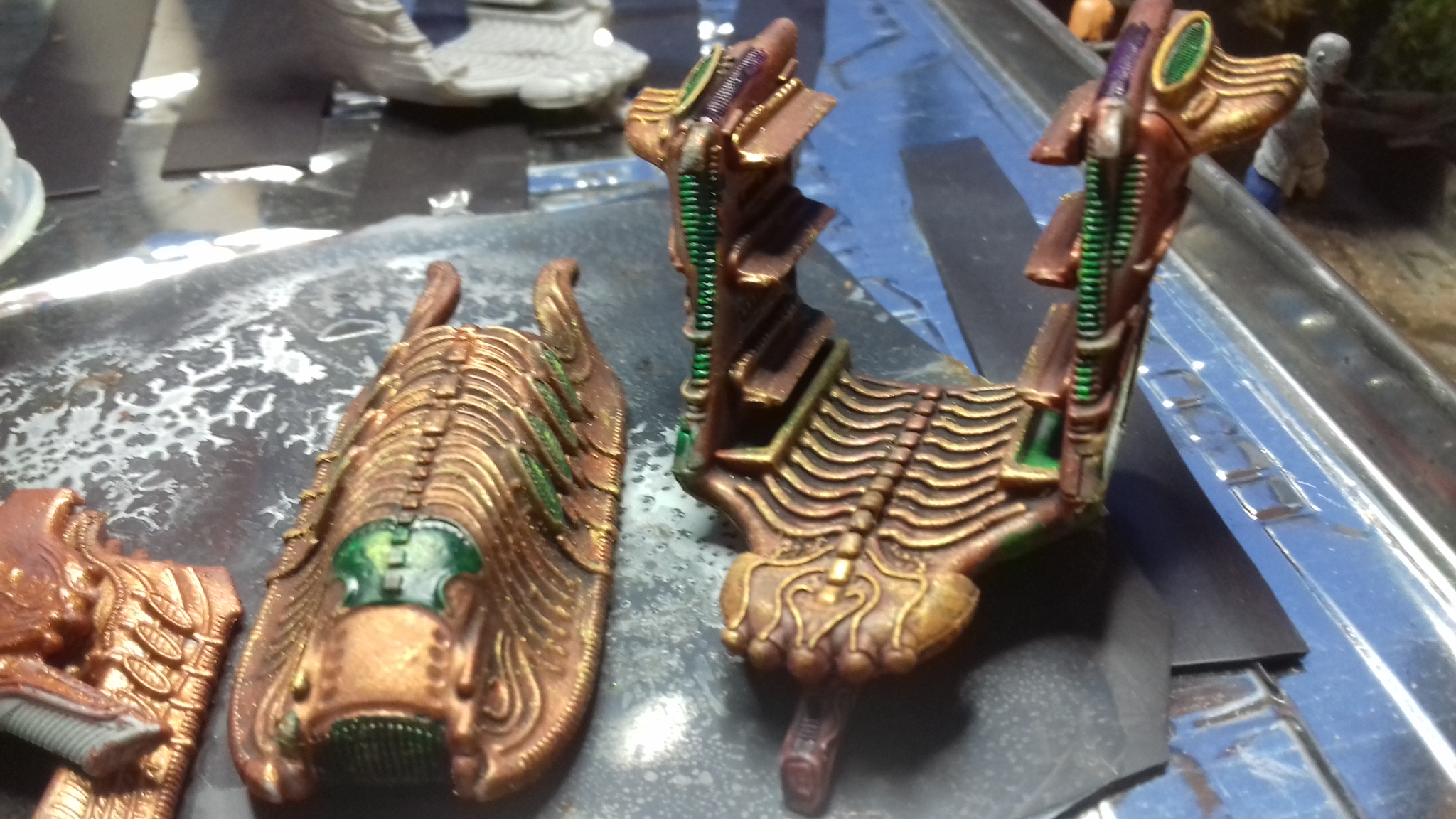
Brass supervillains: work in progress
I primed the vehicles grey and basecoated them with GW’s Gehenna’s Gold. Busy now with orange and other details, and shiny purple. They must radiate evil, from the first moment they enter the board.

Infantry in basecoat: German field grey combined with purple pants and brass helmets. White, purple, green, orange, thats vintage Joker, indeed. I will brighten them up and add pale greens and purple.
I haven’t decided about the UCM colour scheme yet. UCM are the human army in the game. So I might paint them in camo WW2, in a vintage dark/blue Batman colour as antagonist to the supervillain scheme or in stylish black and gold: the new Batman Dark Knight of John Player Special Formula One palette. I will post a full update when the project is finished.

3 thoughts on “How to paint ‘evil’ alien (Dropzone) spaceships”