

What are the correct Martian, Rebel, or X’thingion uniform and spaceship colours in the 25th century? The bad answer: we don’t know. The only right answer: if you research movies and the internet, good suggestions will pop up. SF colour guides follow strict codes and conventions. Below 1) a summary of familiar colour palettes combined with 2) an updated colour wheel 3) practical painting tips. With links to inspirational pictures.
It’s a generic painting guide for 6-15mm, although I wrote it as preparation for my own Dropzone Commander project. I will soon publish a Dropzone Painting Guide as follow-up.
Rule 1: Remember, SF follows archetypes
Yes, all spaceships and 3000 AD-tanks, including the form and the colour, are of course fantasy. The whole idea of explosions, sound and fire in empty space, 270 degrees below zero, no oxygen, is nonsense, (check this great video about the physics of space battles). And why would a spaceship need wings and an afterburner?
However, 50 years of comics and Hollywood movies have dictated the appearance of the archetypical SF cruiser, jet, tank, mech and walker. SF colours and patterns communicate: for example that a model is hi-tec or lo-tec; ‘human’ or ‘alien’; ‘good’ or ‘evil’; regular or pirate. Think. Why do the evil Tie-Fighters have big black shields while rebel fighters are represented as light grey, almost white, space jets with red lining – like medieval white knights? Why does black robed Darth Vader wear a WW2-German Stahlhelm? Your painted model will not convince if it doesn’t copy an archetype.
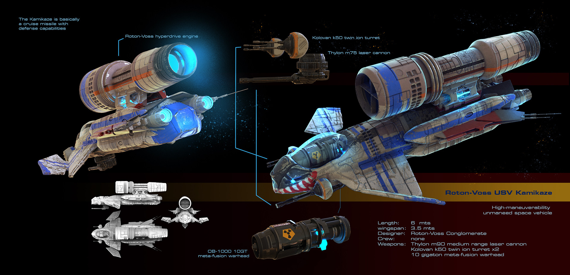
A catalog of 75 inspiring spaceship concept art can be found here.
Rule 2: silver, grey or black metallic are dominant
In the 1950’s the common image was the silver/ metallic flying saucer. Star Trek brought us space battleships in battleship grey, styled as flying saucers with delta wings and red lining. Star Wars was inspired by WW2 dogfight movies, thus featured jets with afterburners and wings (the Death Star trench run is a remake of the final scenes of WW2 movie ‘Dambusters’).


‘Evil’ hi-tec is often black metallic. Compare the Close Encounters of the Third Kind, the TIE-fighter and the black lined Cylon Raider from Battlestar Galactica. below.
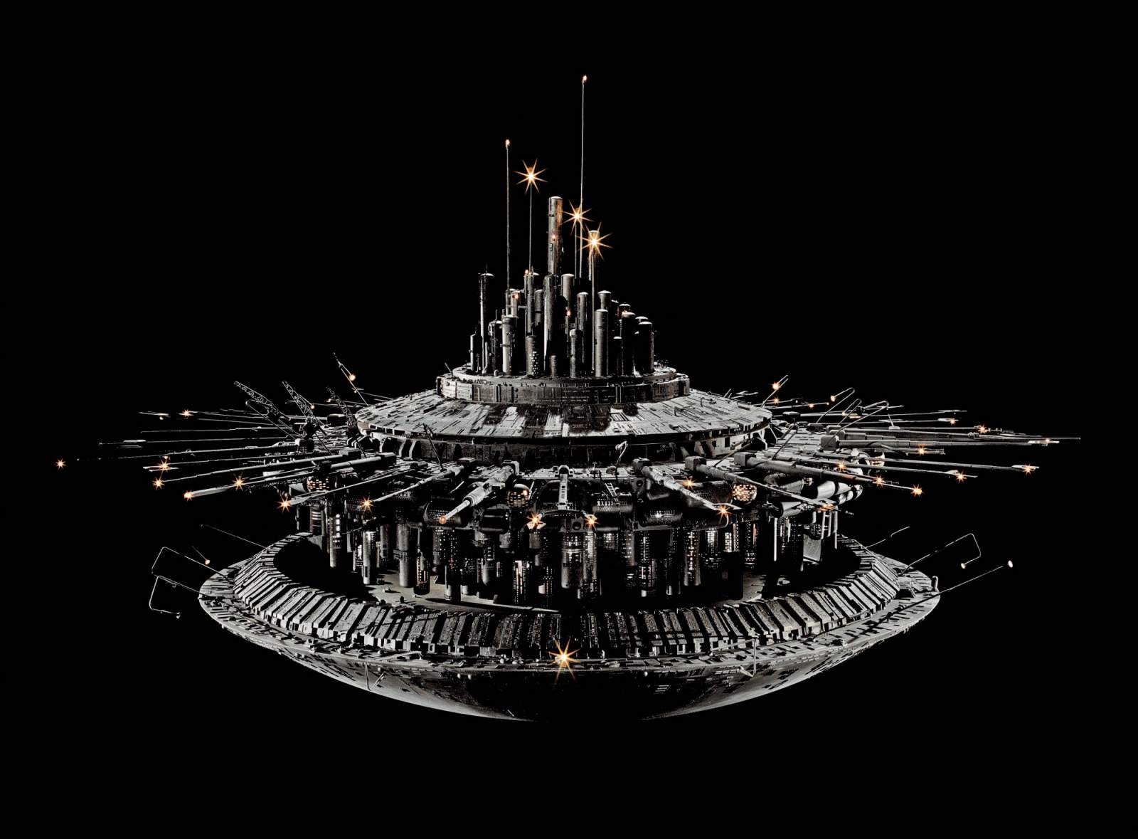


Silver and black metallic radiate hi-tec, check the colours of your computer, phone, television and CD-player. Grey is a battleship colour common for space (battle)ships. White is NASA. Light grey with red lining is Star Trek and Star Wars. Often SF ground troops follow the same colour conventions.

Rule 3: Bright Colours For Manga, Transformers, 40K, Mech; Not For Classic SF
Bright blue, red and yellow are popular for GW toys and manga-inspired cyborgs. It’s fantasy, toyish, medieval knights in futuristic armour.


For the ‘classic SF’ like Dropzone Commander models I dislike this style, at least for human UCM and PHR. It might be excellent for large 15mm-28mm 40k models and Battletech mechs. If it looks like a transformer, walks like a transformer and talks like a transformer, paint it like a transformer! But if not…


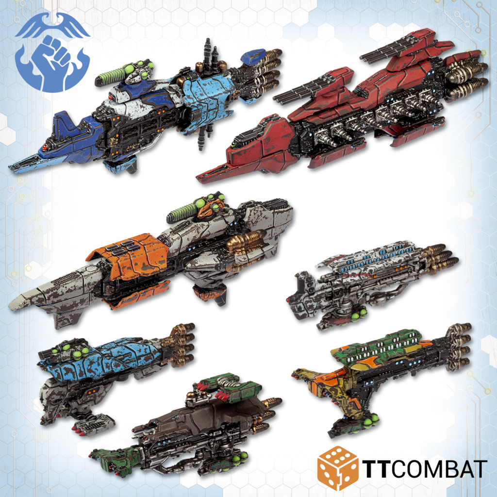
There is one exception to the rule and that is ‘rogues’. ‘Classic’ rogue and pirate battleships are often metallic with colourful parts, as a signal that they’re not ‘mainstream’ and not ‘uniform’, but ‘irregular’.
Rule 4: WW2 Camo Looks Fine, But…
Standard camo – olive drab or sand yellow basecoat or grey with a camo pattern – is a common painting choice in SF.

It’s a perfect and very safe choice for semi-realistic ‘classic SF’ models. I’m not overenthousiastic, however. Standard camo may remove the futuristic look of a model, is difficult without airbrush and decreases the beautiful hard contours of a SF miniature, even more on small scales. If you go for it, try as a more creative, more contrasting, more ‘alien’ camouflage.


Interesting variation: some hobbyists paint futuristic rectangular and square camouflage instead of standard cloudy stripes.

Notice how all painters above have accentuated the black lines between the panels of the models.
Rule 5: Superhero Colours Can Typecast Your SF Vehicles.
I’m a big fan of what I call the ‘superhero colour combinations’. When in doubt, I check this superhero colour theory link.
- Strong heroes wear red and blue (Superman)
- dazzling, energetic heroes red and yellow (Iron Man)
- distant wise heroes / police types blue and yellow (Batman):
- evil geniuses wear green/purple (Green Goblin);
- dark clowny heroes purple/orange ;
- true evil characters purple/orange/green/cold white – yes, The Joker, and Kingpin.
Grey and black give heroes and villains a darker, more gothic effect – compare classic Batman with modern Dark Knight-Batman. Earlier, I successfully used the superhero/villain palette for my Zombicide survivors and zombies.


I also used it for my Scourge army. The Scourge are alien hi-tec bloodsuckers. Evil. My base colour for the dropships and vehicles is brown gold metallic – orange. I combined it with green – aha, evil. They didn’t look evil enough, so I added purple and white. Classic supervillain Joker/Kingpin. See below.

Rule 5: Analogous Is Best For Mass Armies
I hadn’t painted fantasy / SF miniatures for a very long time so I needed to rediscover the painting style. I stumbled upon a helpful colour wheel from Sandwyrm. It’s helpful because it connects the colour wheel with Citadel colours.

I recommend to read his 3-part pictorial essay, with examples and comments. Summary:
- Analogous colors are hues which are close together on the colour wheel. Miniatures painted in analogous colours often look fine. Analogous is the best way to communicate an intense feeling or unify a large number of elements like miniatures
- Complementary colours occupy opposite positions on the color wheel. This is the best way of showing contrast, particularly if you paint most of your image or miniature with one color and some important detail with the other.
- Besides a straight-up complement, artists will also contrast an analogous range of colors with a complement to that range.
- If you highlight, add white. Because if you highlight analogous (purple with light blue as highlight, or orange with yellow as highlight, the result is less natural.


So, how many contrasting colours should you use for SF armies?
Not many Few. Try (mainly) metallics with analogous colours, maybe small parts in a contrasting (complementary) colour. I tried three-tone-palettes (orange/green/with too much purple for Scourge, blue-grey-red for UCM, but that was ugly. Somehow, too many or too bright colours on a small model are distracting. In SF-movies hi-tec planes and tanks never look like an African T-shirt. In the end, I limited the use of a (third) complimentary contrast colour to small parts of the model.
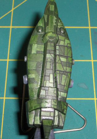
Paneling and analogous colours: a step-by-step-example
2002 Golden Demon winner Joe Wiedeman from Cincinatti published back in 2008 a spaceship tutorial instructable that I uncovered on TMP. The style was not suitable for my Dropzone dropships, but might be perfect for big space cruisers and battleships.
I noticed btw that in this example he is using analogous colours in the green spectrum, he accentuates panels and geometrical shapes. Thus, the spaceship has a ‘typical’ futuristic appearance and doesn’t resemble a mere WW2-in-space-plane. Thumbs up for his painting.
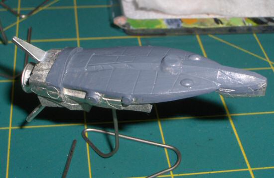
His step-by-step-pics below, from basecoat to finish:


Rule 6: Ink, Don’t Paint
I don’t believe in hypes so I don’t believe in GW Contrast Paint. Not as such. GW traditionally promoted painting on a black undercoat and sold their customers pigmented, opaque acrylic paint. They also sold inks. In 2019 they revived an old modelers technique known as ‘stain painting’, (diluted paint over a white undercoat) and introduced a new range of improved inks, the so-called Contrast Paints.
That said, I think that the fine lined 6-15mm models need very thin layers of paint. Thick paint eliminates the fine lines between the panels that are IMHO essential for the SF appearance. Even more with Dropzone, the models have very fine details. Thus I recommend to apply a thin light undercoat and a coloured wash – Contrast Paint.
But you don’t need Contrast Paint to contrastpaint. Instead of buying an expensive new range I use my old GW inks, and I bought Vallejo thinning medium to dilute my standard Army Painter and Vallejo paints. AP sells coloured washes btw with the same effect as Contrast Paint. Vallejo Model Colour is more transparent and fluid than Vallejo Game Colour or Army Painter.
In short: Contrast Paint is a good choice. Other options are available. Anyway, make sure that you ink the model and/or use very transparent colours.
Expert tip: I bought Vallejo metal medium. If you mix it with wash/ink, it will give a metallic look: chrome red, silver grey, etc.
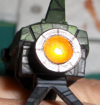
Rule 7: Paint Reflecting Cockpits
All serious spaceships have serious reflecting cockpits. Blogger Four Realms of Chaos published a good 6-minute instructable on YouTube.
Rule 8: Never Forget The Plasma Effect

You better return to WW2-wargaming if you hate plasma guns because they are dangerous for humanity, bad for the environment or if you’re not able to paint plasma guns. But maybe read this easy tutorial here, first.
Rule 9: Buy decals
Decals on wings and tanks enhance the look of the miniature, and when camouflaged, even more so. Magister Militum sells WW2 aircraft and tank decals you can use. I bought SF Hammers Slammer decals from Brigade Models. Piranha sells Battletech decals.
Rule 10: Panels! Panels! Panels!
SF is all about blingbling, panels and contours. Extra lining, extra highlighting and extra contouring is advisable according to all instructables on the web. All painters in the instructables reline the panels with a dark wash and all advise to highlight the panels, instructable here. Dropzone suggests a nifty trick btw, to scratch off a little paint from the corners.
A Word About Dropzone Commander
I like large land battles in small scales. I play Napoleonic and WW2 in 6mm so 6mm SF seemed a logical choice. The 10mm DZC miniatures however are very well sculpted and I think that 10 (and 15mm) does more justice to the individual beauty of SF than tiny 6mm. The 50-pound (now OOP) 2-player set with 2 armies and cardboard scenery was a bargain and the boxed armies and discounted scenery sets still are. Not only for DZC, but for many available SF games, like Quadrant 13, Gruntz, Dirtside, Future War Commander or Dark Horizon.
Useful links
- For Dropzone: the unofficial 1.1. Army Builder and the Orbital Bombardment blog. The official 2.0 Army Builder and other resources can be found here.
- For Quadrant 13: the Q13 vislardica blog
- Gruntz, a SF Warmachine ripoff, better than the original Warmachine rules, independent review here
- Dirtside, a free ruleset from Ground Zero Games.
- Future War Commander, a generic Warmaster-SF-set
- For an overview of SF Spaceship colour combinations, try this link.
- Brigade Models: check their Hammer Slammer rules and decals
- Other decals: Piranha Battletech decals
- Joe Wiedeman’s spaceship tutorial instructable on TMP
- The Back40K’s 3-part essay about colour theory

3 thoughts on “The Good, Bad And The Ugly: A Painting Guide For Mech and Starship Wargamers”